• 0 Posts
  • 43 Comments
Joined 3 months ago
cake
Cake day: August 21st, 2024

help-circle
  • it’s weird that. it’s obviously possible to have a flat-shaded skeuomorph, just look at basically all of windows 95, but for some reason we connect them to this particular graphical style. files and folders are both part of the old classic “desktop metaphor”, so they basically have to be skeuomorphs. but like, the application icons are basically just mosaic tiles of the normal icons.

    a proper skeuomorph would indicate what the program is for. krita and whatever map software that is are both good, if a little flat. but the libreoffice suite just being squares with a letter on them? have them be like, a spreadsheet for calc, a stack of cards for impress, and a printed page for write.

    remember all the icons for windows 95 network utilities that have people in them? those are also (attempts at) skeumorphs because they’re trying to communicate what the program does.


  • a skeuomorph (from greek, “tool/container-shape”) is something that retains the characteristics of another thing that it is based on, even though those characteristics are no longer useful. think lamps shaped like candles, or the floppy disk save icon, or media player programs with volume knobs.

    skeuomorphic UX is a good way to get users comfortable with a system by using designs they are already familiar with, and the original iphone used this to great effect.

    This is a good example of skeuomorphic UI: skeuomorph
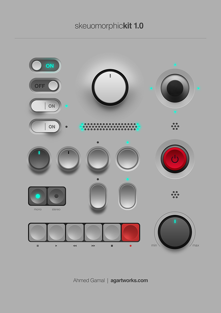
    all to say, I’m not entirely sure these icons are skeuomorphs. they’re just glossy.


  • lime!@feddit.nutoLinux@lemmy.mlThis Week in Plasma: Everything You Wanted and More
    link
    fedilink
    English
    arrow-up
    11
    arrow-down
    1
    ·
    edit-2
    6 days ago

    i can chime in with some actual experience!

    my current problems with KDE are

    • the greeter only accepts my password on the secondary monitor
    • the compositor shuts down whenever something uses the GPU even though the setting is off
    • my primary desktop randomly shunts itself to the right, plopping on top of the desktop on the secondary display and leaving a big black void on half my primary until plasmashell is restarted
    • my panels keep collapsing their content down to the width of a single pixel until i resize them
    • Wayland just crashloops and is completely unusable (no, i don’t have an nvidia card)
    • i still can’t get the acrylic transparency to work :(

    and what’s fun about this is, the issues are so intermittent and random that i never know what i’m going to get on a given day!


  • there haven’t been card fees for end users in Sweden for many years. handling cash is a lot more expensive since you need somewhere secure to keep change, you loose time at the till handling the money, and you need to pay for someone to come pick it up. the time gained from just having the customers pay with card means businesses gladly swallow the fees.

    and yes, i’m always surprised when going abroad how much more analog everything is. the nordics and Baltic’s are generally at about the same level (with Estonia way ahead), but the rest of the continent feels like it’s 10 years behind. I was once asked if I really wanted to pay with card in a corner shop in Leipzig, since the card fee was €10.

    not that i’m a fan of the digitalisation, it makes marginalised groups even more marginalised. i see my elderly relatives struggling with it often.


  • lime!@feddit.nutoTechnology@lemmy.worldOpenAI Is A Bad Business
    link
    fedilink
    English
    arrow-up
    6
    ·
    edit-2
    1 month ago

    there’s no real universal example. you need to show them that it is wrong about something you know they know, to avoid the Gell-Mann amnesia effect.

    I say this from experience. unfortunately some people are just average and have interests that are entirely subjective, like makeup trends or alternative medicine, and the effect that "always check the sources"has on those people is to make them distrust every source since nothing agrees with anything else on those topics.


  • this is more focused for sure, but it lacks the enthusiasm of the original. if i was trying to do this for work, i would appreciate how quickly it gets to the point. however, it no longer reads like this is something you’re interested in. it reads a bit wooden. i get that would happen after you’ve been told to correct your style though.

    to be clear, the original article doesn’t need to be rewritten. for the future though, when you want to tell the story of how you got something working, include your reasons for doing something a certain way. if you need a self-inflicted complication, that’s not really a part of it (unless it’s funny)


  • your writing overall is good! it’s just a matter of information priority.

    here’s a tip, dunno how applicable it is but i use it when writing technical documentation:

    for each step, explain to yourself why you’re doing it the way you are. if it turns out you caused the step to be needed, rather than it being required, you probably need to rethink, or at least add the explanation to the text.